-
http://infohost.nmt.edu/~mentor/Peer_Mentoring_Handbook.pdf
For the document that is user friendly I choose
the NMT Peer Mentoring Program Handbook. The handbook is used for both mentors
and mentees as a guideline. The handbook is very comprehensive with clear
distinctions between the different sections in the book. The screenshot above
is the table of content, which is also nicely labeled and indented to make the
handbook easier to look through if there was a specific question that needed to
be asked. The main colors, aside from the title page, are blue and black. All
the main sections are in blue and boldfaced. If there is a lot of information
about a specific topic all the relevant information is in bullet points which
makes it easier to follow along then if there was just a wall of text. The
handbook also uses different fonts consistently thought the document to
highlight curtain points in the text. The use of different fonts is important
in a user-friendly document because it allows people to follow along a lot
easier. There are also no awkwardly placed spaces in the document unlike the
government document previously discussed. All the text is neatly put together
so the rhythm in the text is kept through the handbook.
-
http://files.consumerfinance.gov/f/201207_cfpb_Reports_Private-Student-Loans.pdf
I choose the Private Student Loan by Consumer Financial Protection Bureau government PDF
as a document that has obscured information because of poor design. All of the
documents text is placed awkwardly to the left while the right side has a lot
of free space. This misuse of white space creates cramped text in the overall
design. The top screenshot is from the PDF and it has a green and purple bar
graph, which has a lot of problems from the design point of view. From the
design point of view the color choice for the bar graph is just horrible. The
dark green and purple blend in with each other and it is very hard to tell
where one ends and the next begins. There is very little contrast between the
two colors and therefore the graph is unable to show the separation between
“school certified” and “direct to consumer” loans. Looking at the bar graph
also hurts the eyes because of how the two colors effect each other and our
perception of depth. The second screenshot has another infographic, but this
one is a diagram with symbolic schools, that at first look like churches. The
way that the designers did the percentages on the schools is very weird in that
the 5% is barely visible. If they had simply added a little more to the whole
and proportioned it through out the other symbols, it would look a lot better.

-
http://tgcx555.wordpress.com/2010/05/31/burger-king-ribs/
A fast food restaurant that follows the color
theory closely would have to be Burger King. The logo depicts a yellow burger
with the red title in the middle of the burger and a blue circular background
around the burger. The logo uses color and symbolism to attract attention to
itself. The symbol can be considered iconic, indexical and symbolic at the same
time. The logo represents a burger with the title “Burger King” being in the
middle of the buns. The color theory plays a big part in the logo of Burger
King since the three colors that the log uses are blue, red and yellow, which
are the primary colors that all other colors come from. By using all the
primary colors the logo achieves a curtain level of harmony in that the color
contrast each other. By using all three primary colors there is a curtain level
of urgency in the logo that come from the three primary colors. The sweeping
blue line that runs around the logo creates motion in the logo that adds to the
sense of urgency. The logo also uses white space throughout the logo to add to
the depth and perspective of the logo. The billboards that have the Burger King
logo are usually either white squares or the same shape as the logo. The white
space used in the logo blends in with the sign and creates a uniform image.

-
http://uywvker.servebbs.com/amazon-kindle-fire-hd-scroll-right-scroll-left.html
A new media form that refreshes older media is
the Kindle. The Kindle is an electronic device that allows us to reed hundreds
of books from a single source. The Kindle tries to take the place of the book
that everyone has grown so accustomed to. Instead of creating a device that has
a wall of text going on forever like on a web page, the Kindle breaks it down
into a book format. Ironically enough the Kindle is trying to replace the book
by creating an interface much like reading a book. When using the Kindle, you
move from page to page by making a sweeping motion much like turning the page
in a book. You can also place bookmarks to which you can come back later if for
example you really liked a quote or a line. Kindle also saves your spot much
like in the book and it has page numbers like it would in an actual hard cover
book. The Kindle also adds a few features that transcend the regular old book.
Now you are connected to multimedia where you can share how far in the book you
have already read and share quotes from the book with your friends. The
introduction of multimedia into the realm of books is probably the biggest
innovation that Kindle added in its remediation of books.
-
http://www.foxnews.com/
I choose Fox News website as the website whose
credibility might be questioned because of poor design choice. Fox News can be
considered at least somewhat credible (sometimes) so it naturally follows that
their website would have to have good ethos to uphold their credibility. The
two images are form Fox News homepage and at first glance seem normal. The very
top picture has some problems that might just undermine Fox News credibility.
They have the picture of the burned car and the story about Benghazi
whistle-blowers being threatened by the White House. The issue is quite
important and serious but right to the left of the picture is an advertisement
for a new segment called Constitution USA. I believe that the website is
undermined by such advertisement because they are suppose to be a nonbiased
news organization and instead it appears that they believe that the government
is corrupt and the constitution can save us. The picture right under undermines
the website further because this is the quick link to the top stories. When you
have heading like “Brosnan Relives Wife’s Death” right next to “Lack of Sleep
May Harm Sperm” something is seriously wrong with the websites ethos. One has
to wonder what would Brosnan say when he sees his story right next to “Oops!
Teigen Has Dress Mess” or “Sheep That Glow in Dark.”

-
http://www.alexiafoundation.org/blog/2012/08/02/donna-ferrato-how-images-matter/
The image above does a good job in their ethical
reserve of violence. Donna Ferrato took the image in 1988, in Minneapolis.
Photograph portrays a black man being handcuffed by policeman with a child
standing in front and pointing and yelling at the man. The child’s anger
appears to be directed strait at the man being handcuffed and one of the
policeman looks surprised at the child. There appears to be a black woman
standing behind the policeman crying while the television is also playing right
next to the man. They all seem to be standing in quite a poor house with books
scattered next to the TV. The man being handcuffed pointedly doesn’t look at
the camera or the child and is staring at the books on the ground. I think the
photograph does a good job in its ethical reserve of violence. The story goes that
the man was betting his wife and the child is yelling, “I hate you for hitting
my mom, I hope you don’t come back to the house.” The photographer could have
instead taken a picture of the woman and her injuries, but instead decided to
take a picture of the man being arrested. In this picture the victim of
violence is not clearly defined. The man could be considered to be one since he
is the one being arrested and is the center of the photo. The photo also
doesn’t appear to have been manipulated in any way.
-
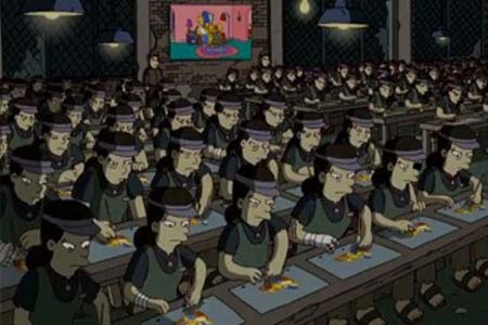
http://www.sheknows.com/entertainment/articles/819130/Banksy-produces-seething-social-commentary-on-The-Simpsons
My favorite cartoon show of all time is The Simpsons. The
Simpsons follow the life of an “average” American family through their
daily lives with hilarious mishaps and events happening to them thought the
episodes. The show has quite a bit of both social and political satire in it
and isn’t afraid to pull any punches. The screenshot that I choose is part of
one of the episodes intros. It depicts Chinese women who appear almost
identical working on the drawing of The Simpsons cartoon. The screenshot
symbolizes the injustice that are happening out there with companies using both
cheap and forced labor to make their products. A lot of people know about this
but no one has done anything so The Simpsons show their own cartoon
being made, making the statement that unless something is done then this
injustice will continue and maybe even evolve into other areas like cartoon
making, although doubtful. The cartoon show has a very distinctive artistic
style that is very unique. All the people are drawn very simply and the normal
skin color for white people is yellow. Color plays a very distinct role since
you can’t tell what nationality the cartoon is presenting to you unless they
divert from the color yellow. The animation goes further into the social
commentary as can be seen in the screenshot. All the workers are frowning and
unhappy to show that this is not the work they want to be doing. Some of the workers
also have injuries and one even has an eye patch. This could mean ether the
conditions where they make The Simpsons is so bad or they are
mistreated.


